
Coloring with Courtney-Contrast and Shadows
Hi everybody and welcome. I am back with more tips and tricks when it comes to your Copic Coloring.
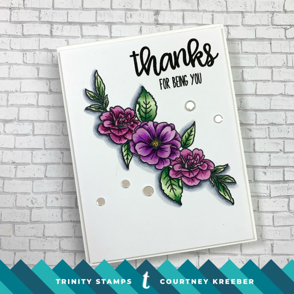
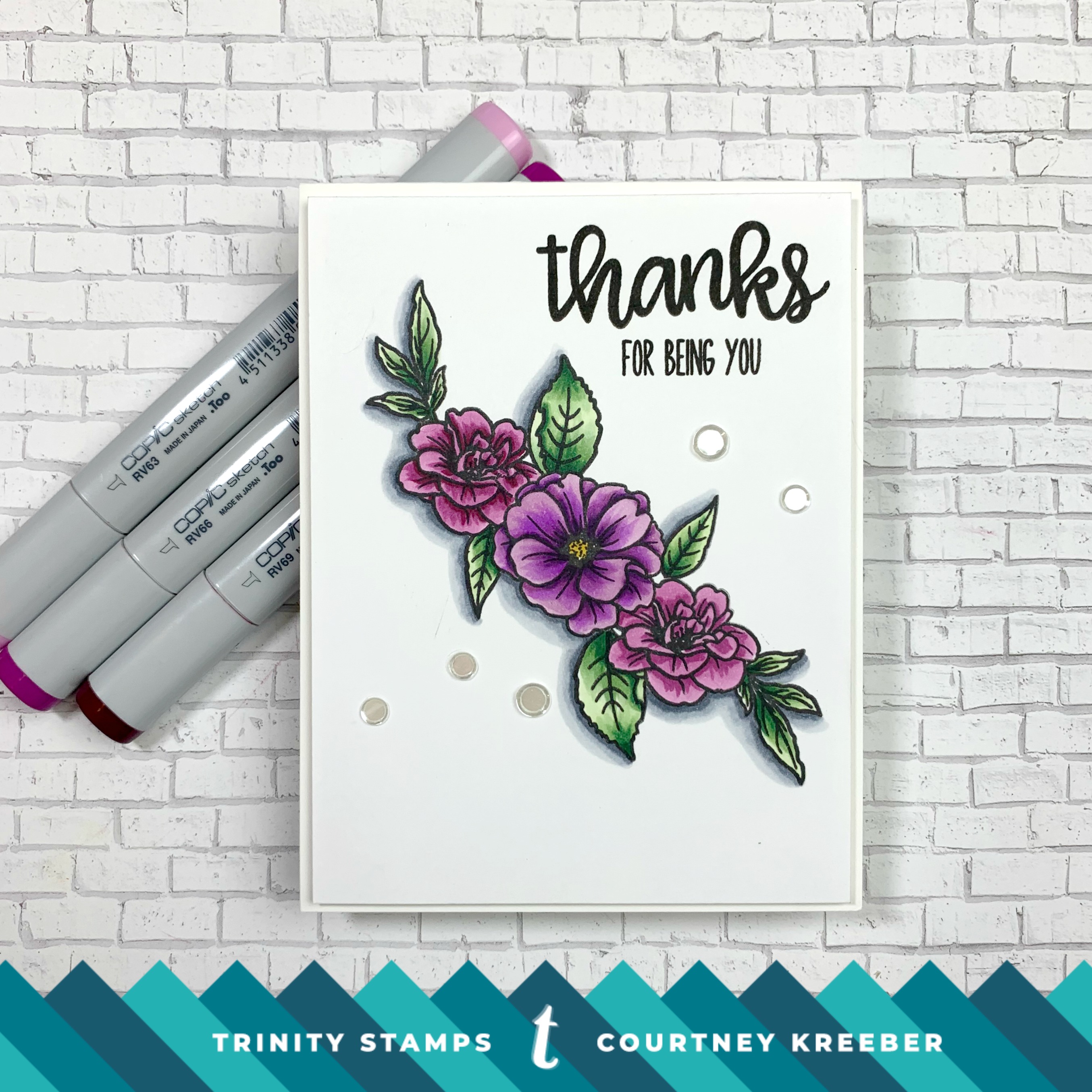
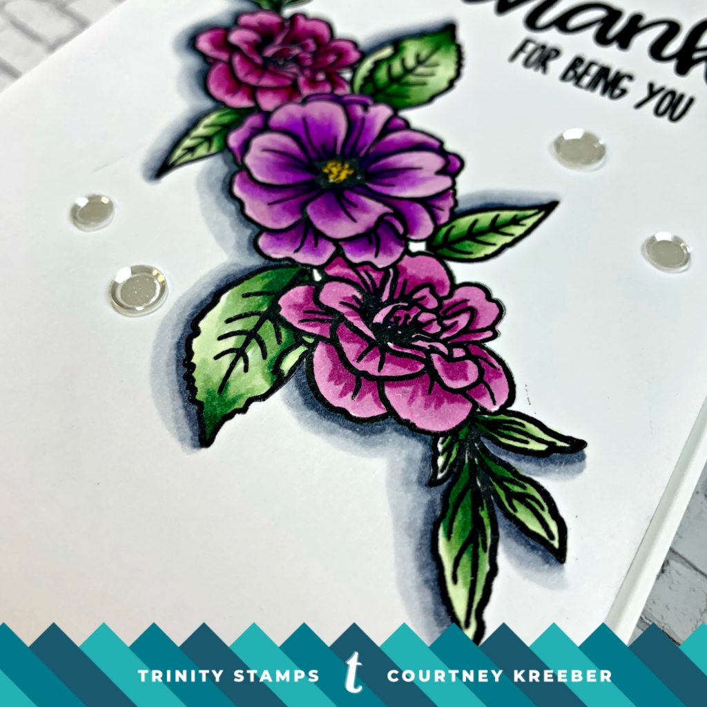
I used the new Spring Fling Florals stamp set to create a very clean and simple card with lots of contrast and some faux dimension using drop shadows.
I stamped and masked a few of the images from the stamp set and colored them with either 3 or 4 color blends. The trick for getting the contrast you may be looking for is adding in that “scary dark color” or sometimes even a “scary light”. Trust me, it will really give you the WOW factor!
Once my coloring was done, I used a few Cool Gray markers to create a drop shadow. Remember, your shadow will be opposite of your light source. For example, my light source is in the top right so my shadows will be on the bottom left. How do you choose a light course? Do whatever YOU are comfortable with.
Be sure to check out the video for more tips and tricks. Thanks for stopping by and have a creative and crafty day!
-Courtney


Such a pretty card!
So gorgeous, Courtney! I am one who is very scared of those dark colors but they sure do make a difference. You are so inspiring!
BEAUTIFUL CARD!!! Love the contrasting shading, not only does it pop it adds flare too xxx plus the embellishment add ons round it off to be spectacular!!! STUNNING BEAUTIFUL CARD