
Re-working cards making with Erica
Hi guys!
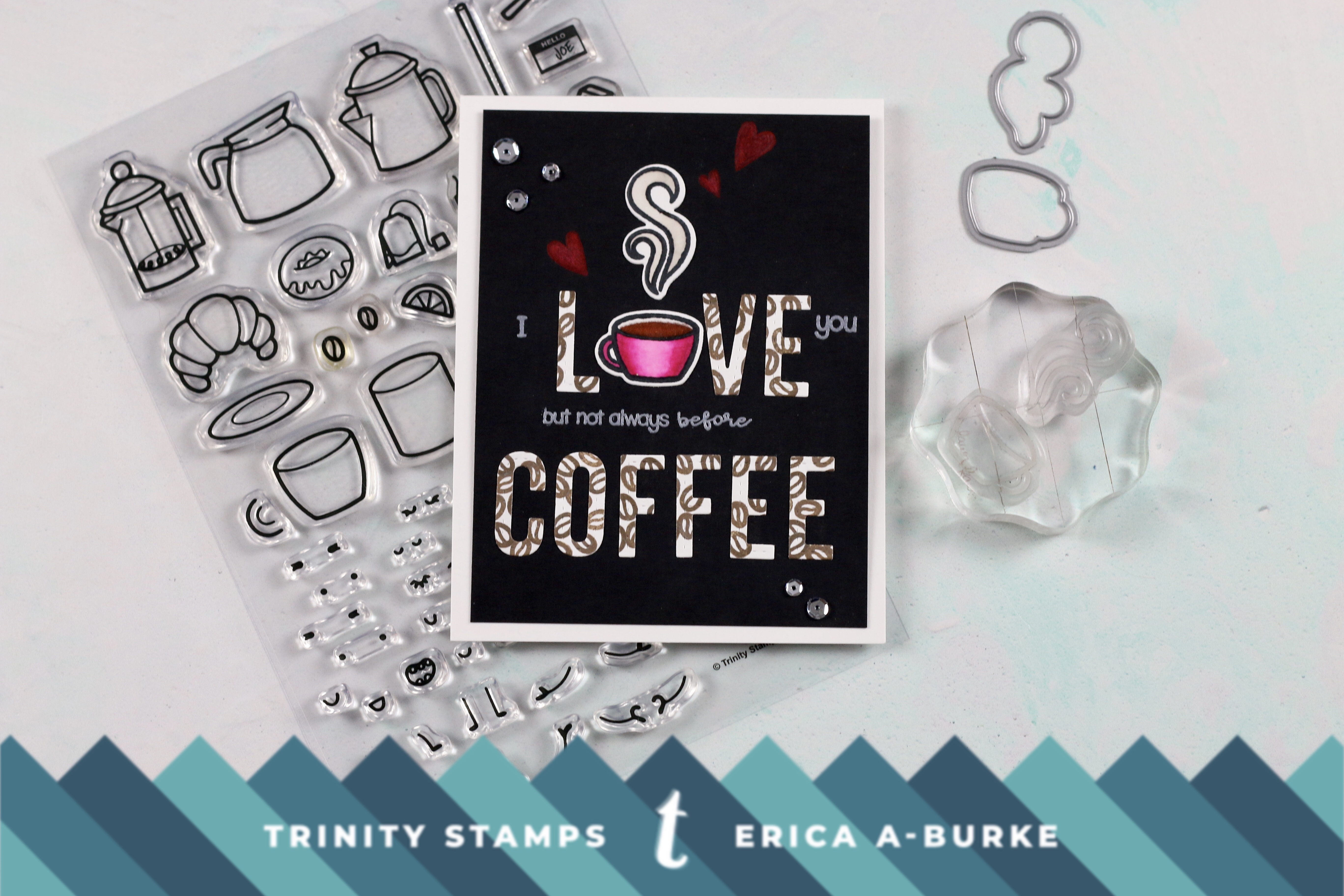
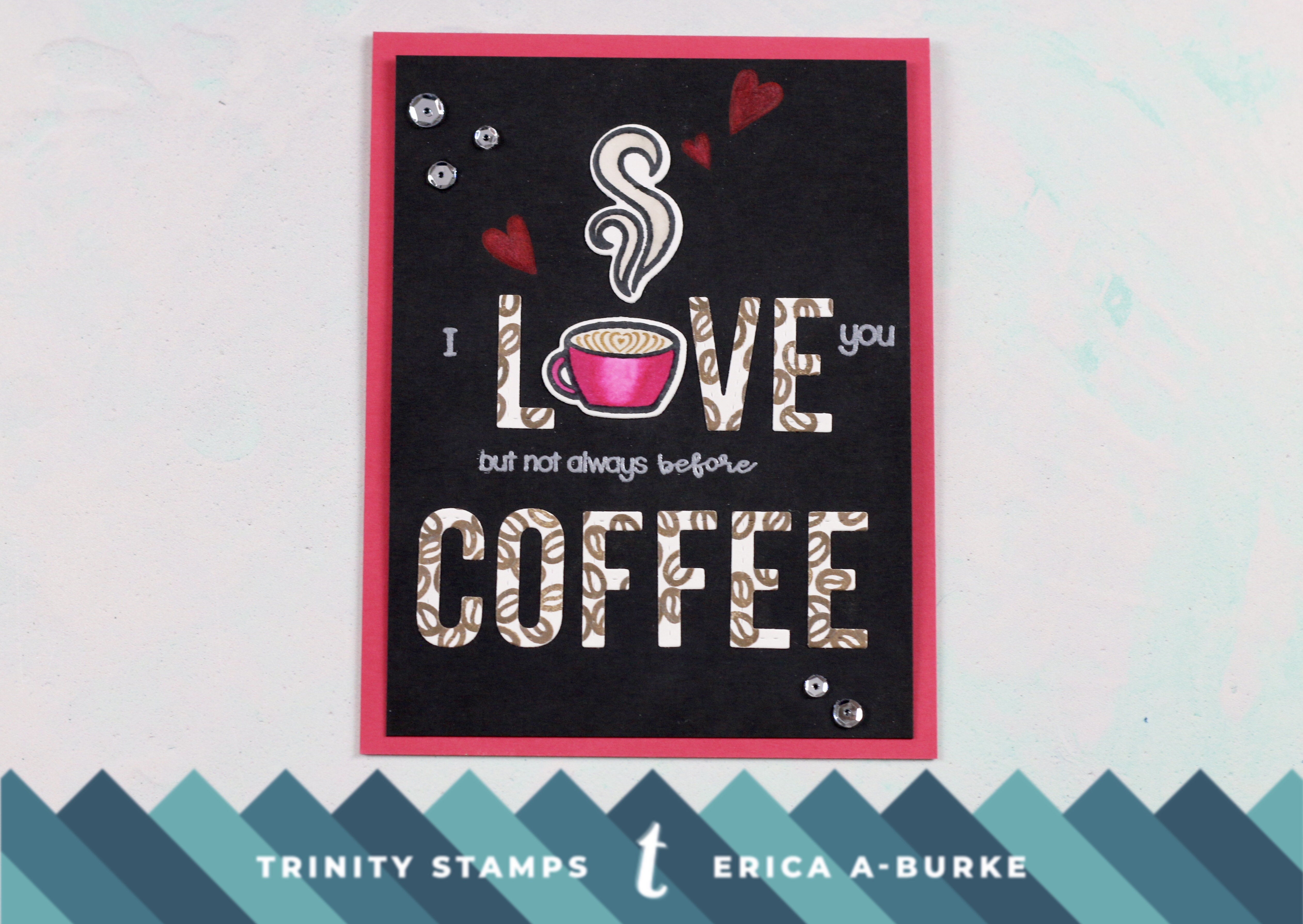
Today’s post is a bit different from my previous posts. Not only is it a minor essay, sorry about that but today is all about a do-over. Or several actually if you want to be technical. The stamp and diecut sets I have used are Coffee with Character and Caffeinated Sentiments.
Time for a truth bomb: I can be quite the over-thinker… Oh yes, this is so. No amount of self-confidence and success at making cards can sometimes quiet that pesky voice that insists it’s. Just. No! Good!! I also happen to have an actual voice saying this to me too, in the form of my husband, The Man. In fairness, only when I ask for his honest opinion. It just would be nice if he wasn’t so darn honest at times, eh?? Like about last week’s card for instance. He was NOT a fan. Not at all. If you missed that post, you can find that by clicking THIS LINK.
To summarise, he didn’t like the colouring on black card stock. In his honest (there it is again) opinion, it looks dull and the colouring doesn’t shine as much as on white card stock. He suggested re-colouring the cup and the steam, diecut them and add them to the card on top of the images I had already coloured. I may or may not have told him to go stuff himself and left it as it was. Eh, nobody is perfect.
I must point out here that while it sounds like he’s really critical it’s always constructive criticism. He’s not a monster, lol!
However, as I was still not quite sure about the whole thing, I decided to consult a crafty friend. She pointed out that the whole thing was off-centre, which is true, and suggested maybe trimming it down. Pattered paper or something on the side might be nice? All very good suggestions but man, where to start?
I was left with banshee-loud voices taunting me at this point…! Just inside my head admittedly but man, it might as well have been on speaker in my craft room. In the end, I decided to just leave it as it was. Which finally leads me to today’s post: I’m re-working the same card to see if I can come up with a better solution! Might be a bit of a cheat as it’s not a brand new card but I can’t be the only one who has these crafty dramas? Right? Please tell me I’m not the only one???
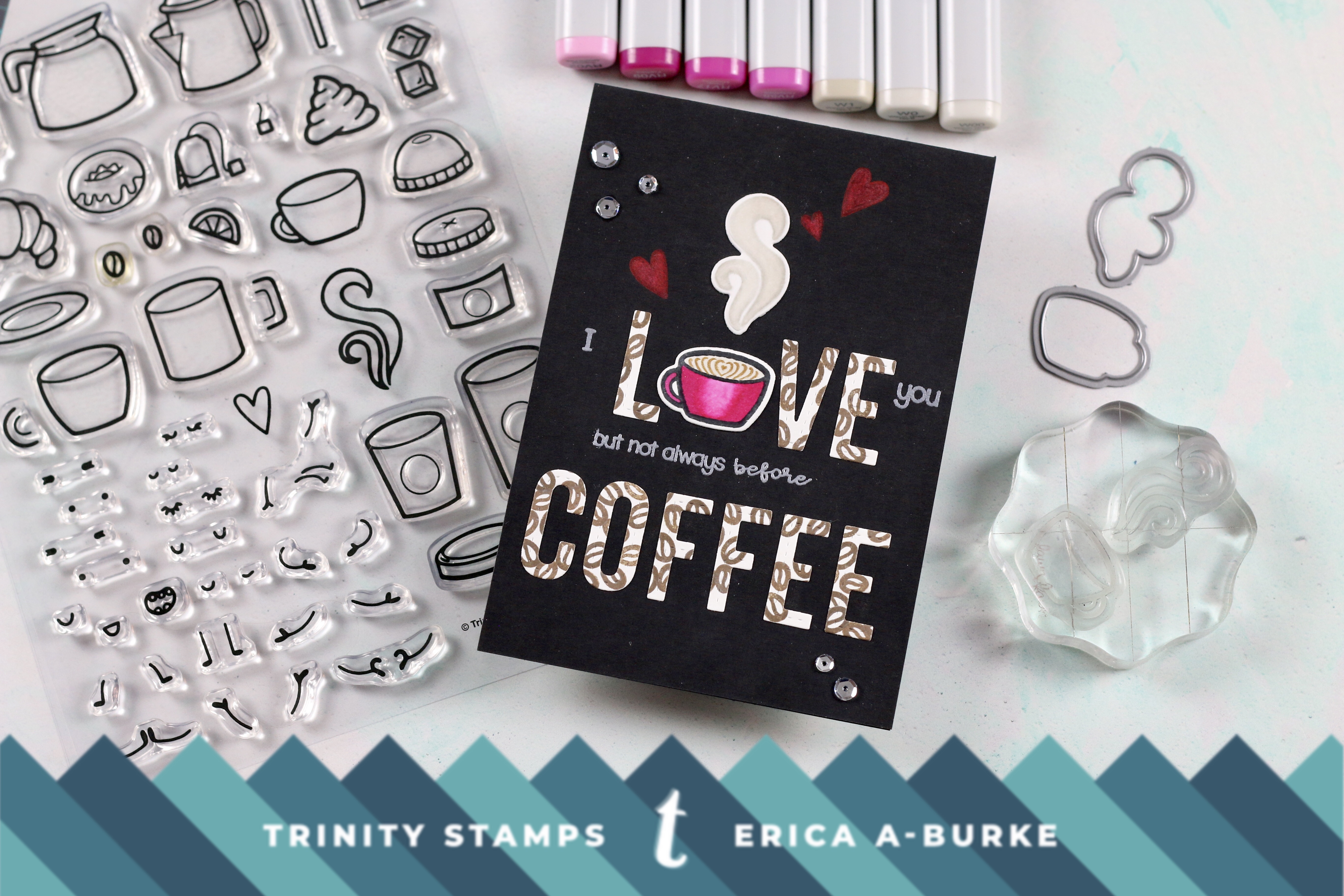
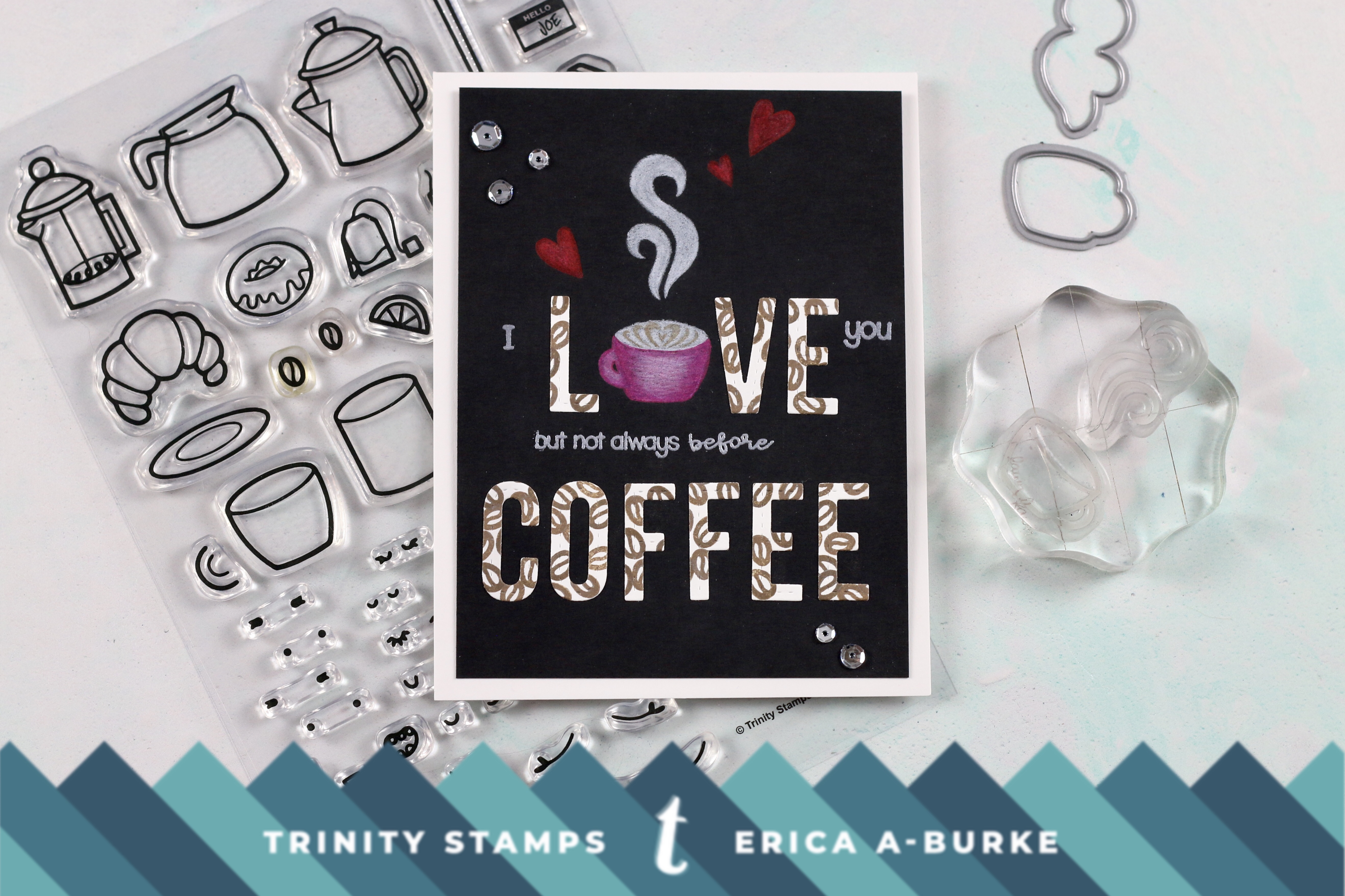
To begin with I stamped up the cup and the steam from Coffee with Character set, both in black and fade-out ink, on Copic friendly card stock. Then I coloured in the images, some with more success than others. I’m not sure what’s going on but all of a sudden, I’m extra rubbish at no-line colouring with Copics! My cup turned into a hot pink mess. I was not happy. No, Sireè! At least I managed somewhat with the steam and the other two cups I had stamped up.
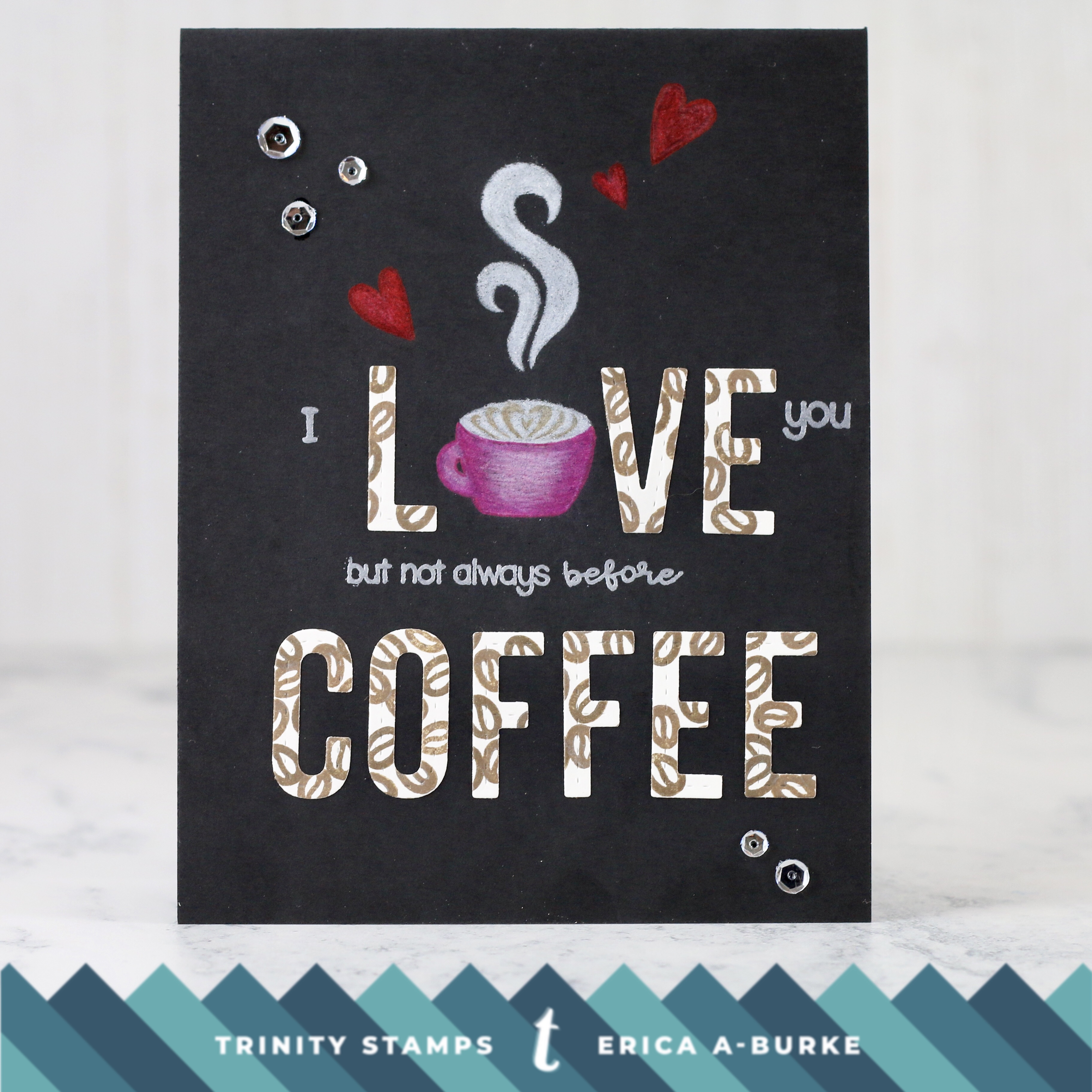
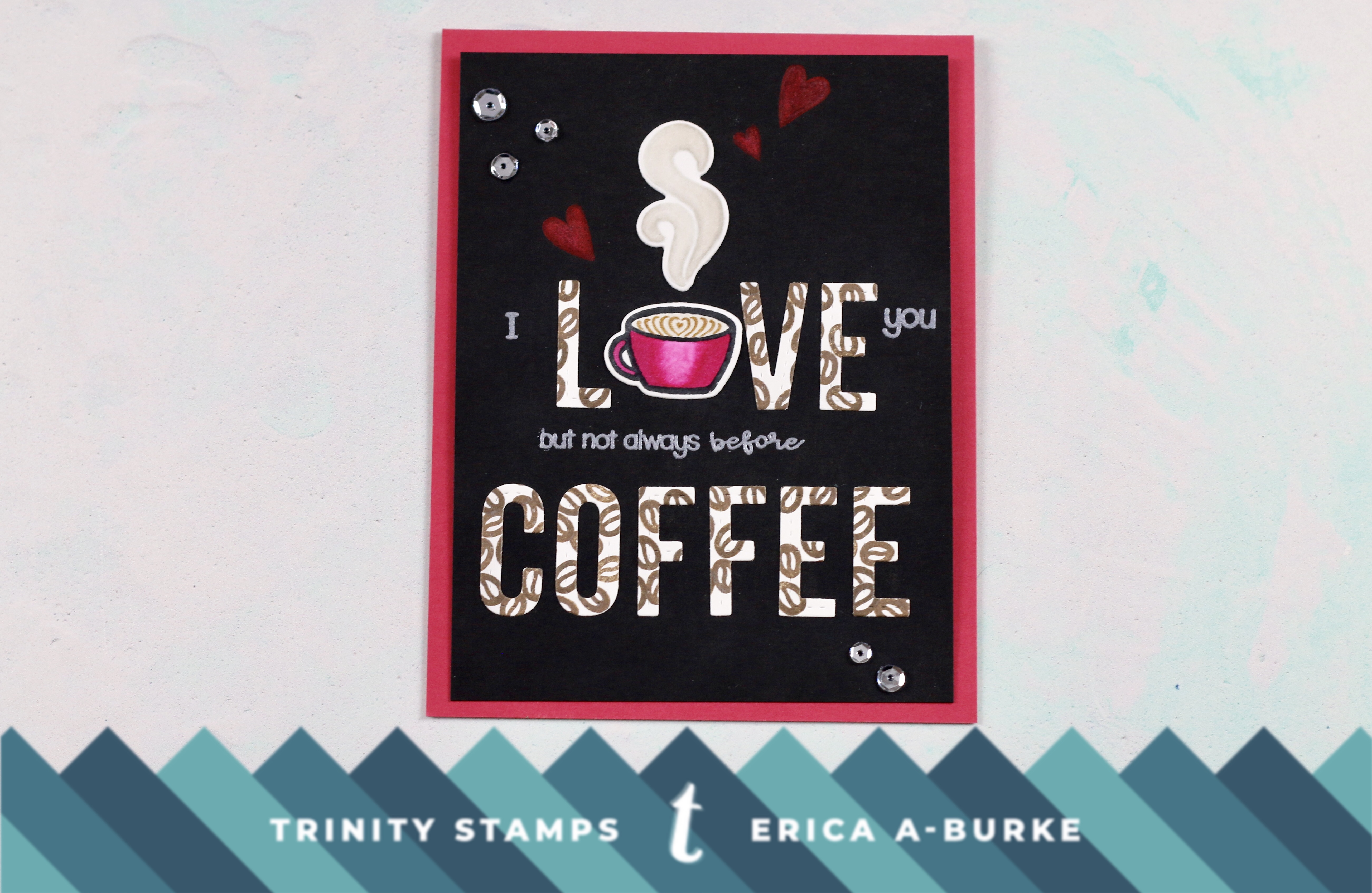
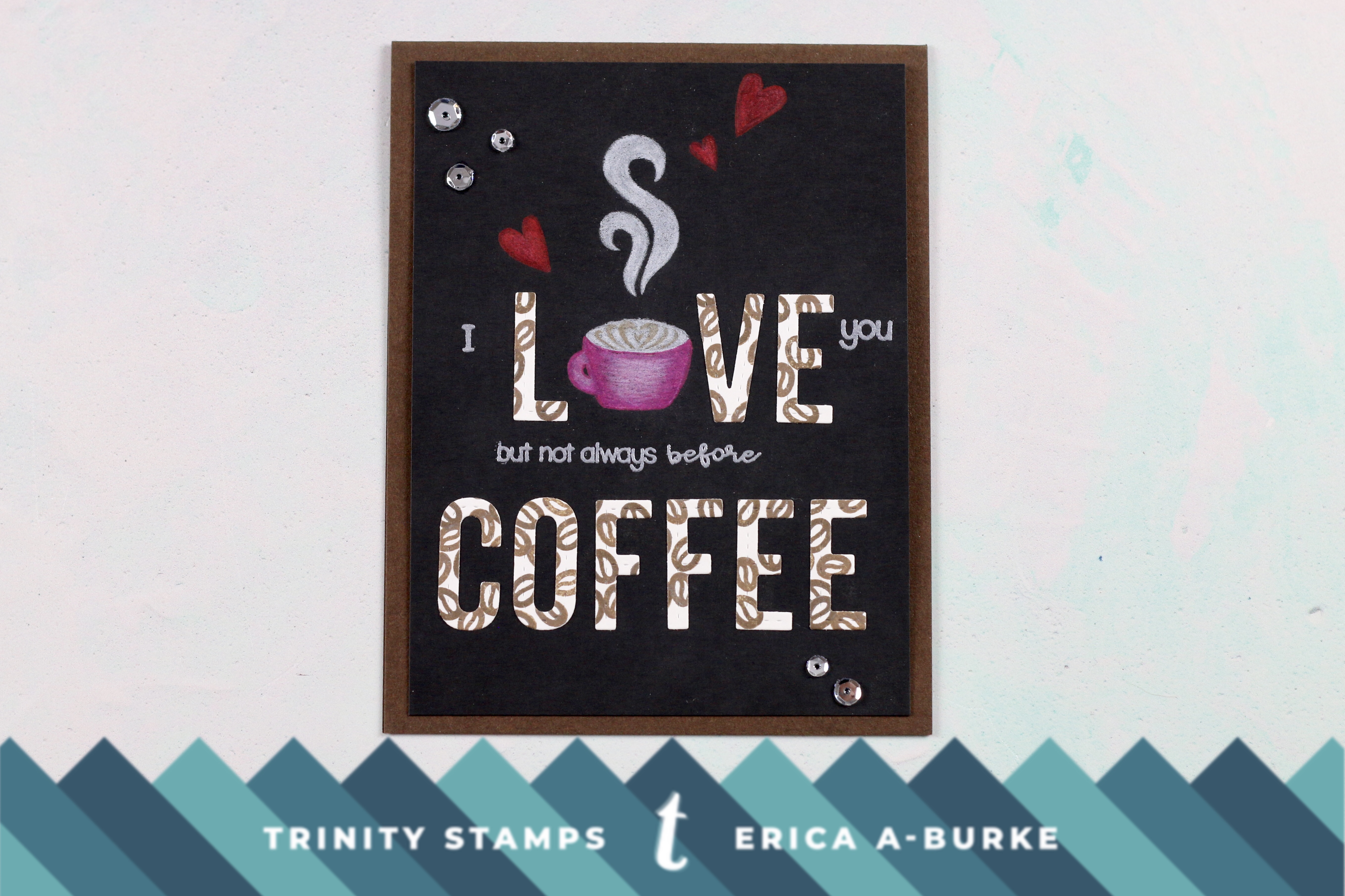
Then it was time to try combos. Cup with foam art or just coffee, matched with steam with outlines or no-line coloured? Trim? Pattered paper background? Solid colour card base? I tried them all! And I must admit that I actually like the look my husband suggested; to colour the images on white card stock, cut them out and add on top. It looks great, doesn’t it? Darn it…. time to eat humble pie! Or maybe just call it even as he admitted he actually like how it looks in photos better than in real life. How is that for a twist?
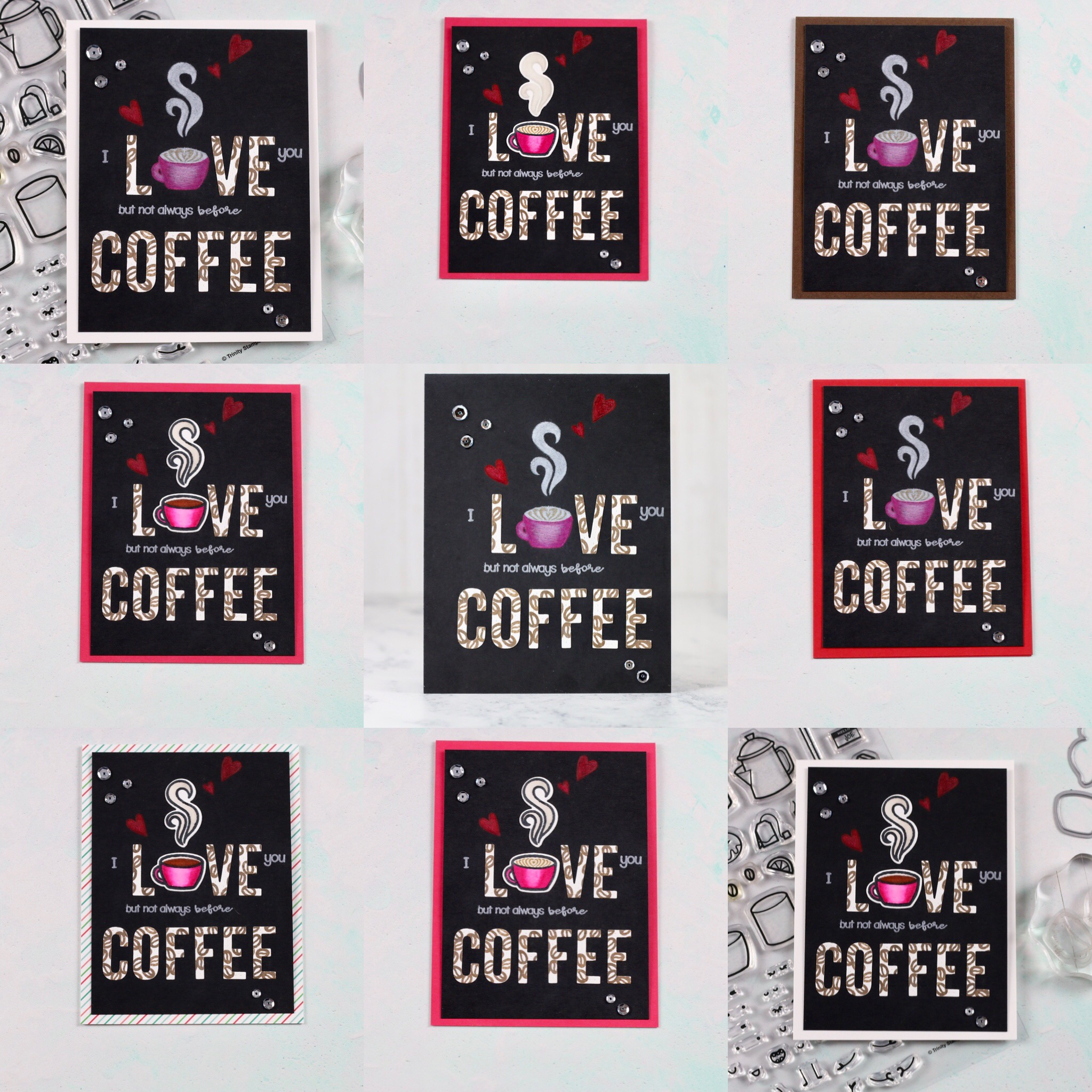
Anyway, here are some different combos I tried on my quest to find the best look. I will freely admit that I am quite fascinated a card can look so different with just a tiny adjustment.
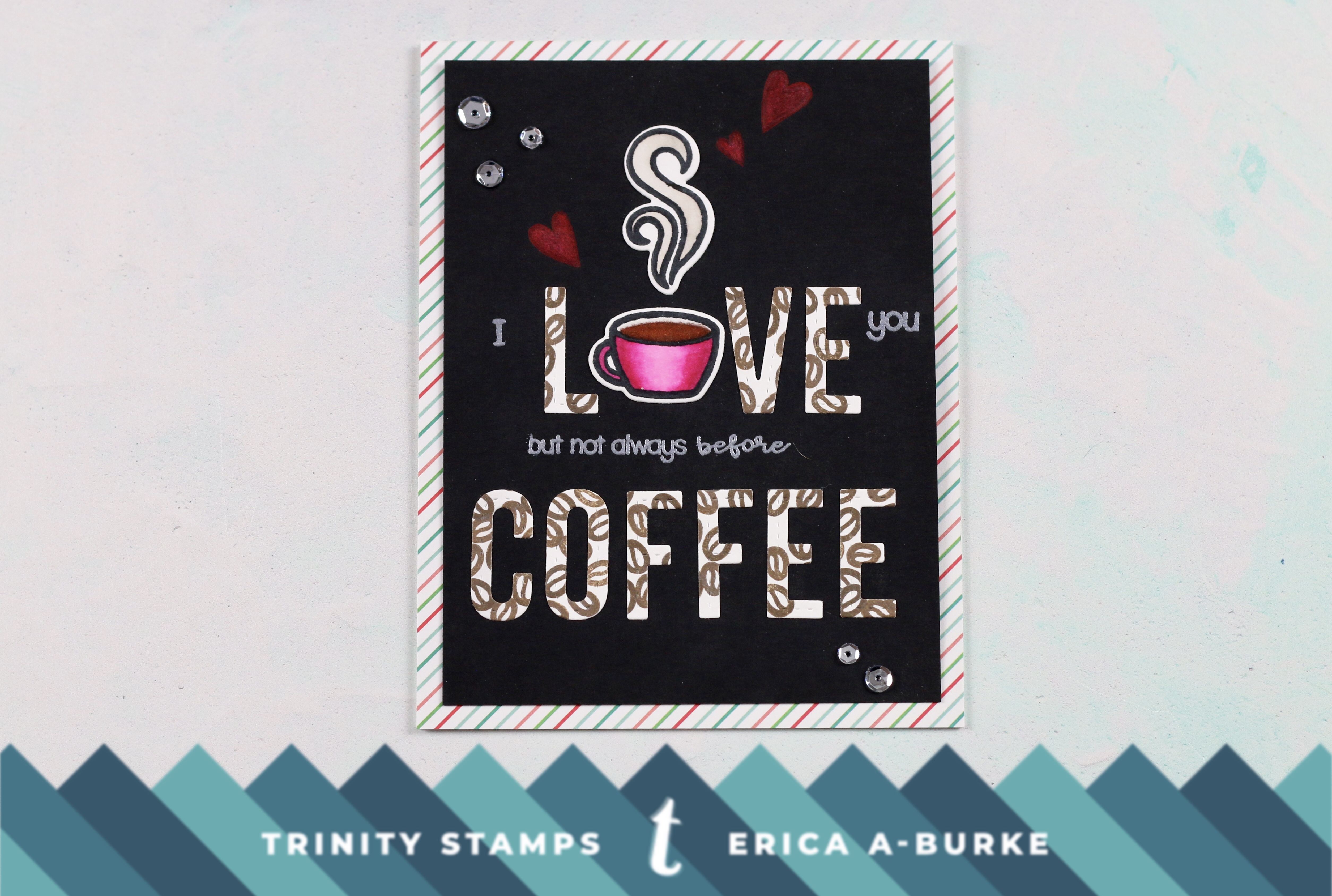
Right, so first we have the card slightly trimmed down to centre the sentiment and the images re-coloured and added on top.
Here I have actually cut the card base in half to free the front part, I also trimmed it down to 5″x3.75″ and tried it with a white card base. Not too shabby but it could be improved. This is the original colouring, no new images on top.
Here is the same but with a cup and the steam added on top. I prefer this one out of the two.
Next I tried some stripy patterned paper. Quite cute but not the right colours on the pattered paper.
On to solid coloured card bases, red was my first choice but nah… Maybe with another cup coloured up in reds, though? Hmm. Thoughts?
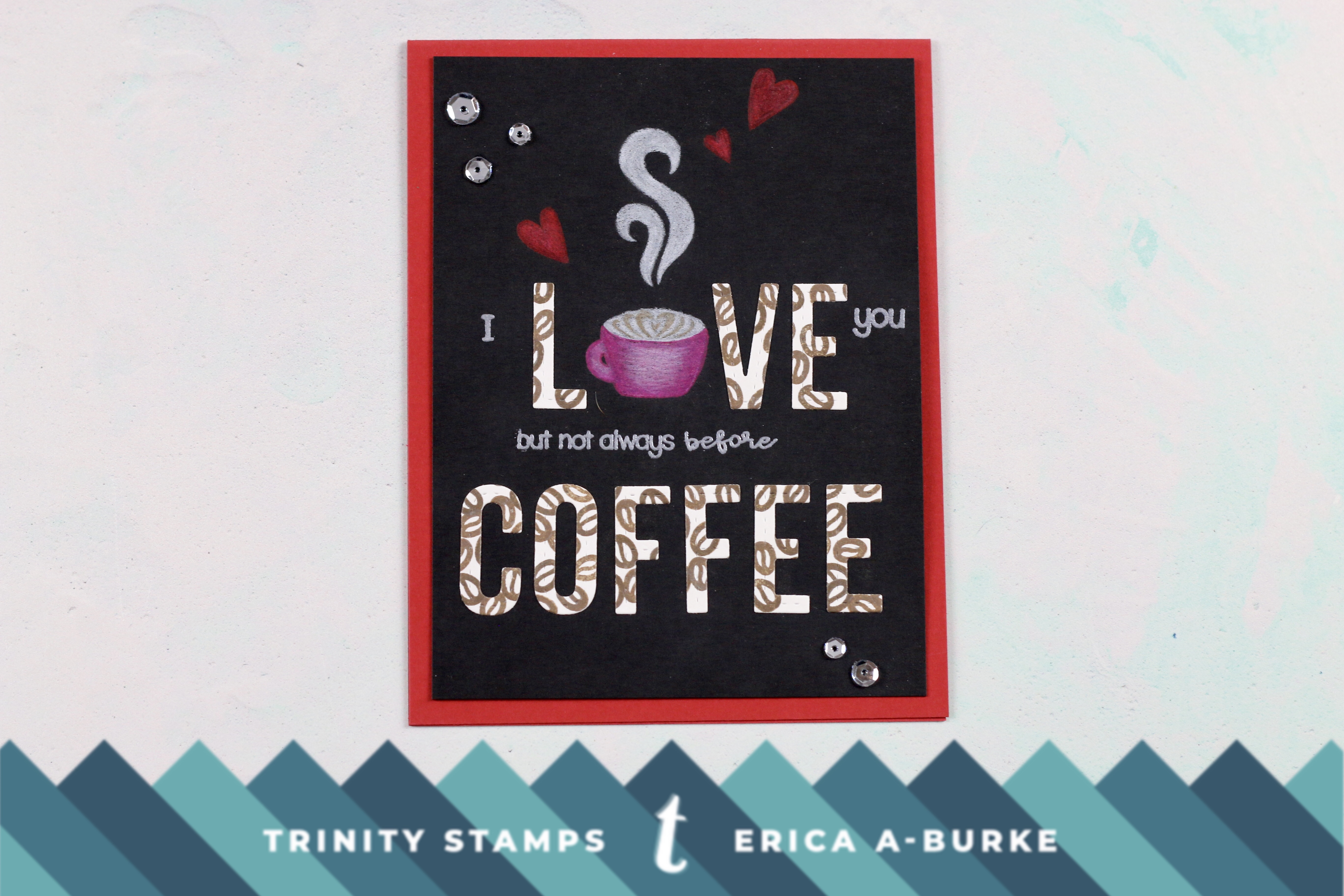
Guava coloured card base was a bit better, but still not quite right. It looked better with the images added on top though. First up was the no-line coloured steam.
Here is the same set-up, only with the steam outlined. This looks better, in my opinion.
Brown card base was meh…. I didn’t even try it with the images added. This was definitely an idea that worked better in my mind.
Well, after all that, what do you think?
I decided to go have a cup of coffee instead of finalising the card so it’s still a PhD aka Project half Done. Maybe I will go ask The Man again, seeing as he actually was kind of a little bit right about the first card…. lol!
Thanks for stopping by today and for hanging in there to the end!
Lots of love and happy crafting from Erica


That’s a creative take! Thanks for sharing this idea
Oh I love these!
I love that you showed us all your different ideas with photos. Glad to know I’m not the only crafter that second (third, fouth, fifth…) guesses herself when making a project. My PhD pile is a mile high…. Maybe I’ll take your process into my craft room and try some subtle differences and see what I come up with!